TIMELINE
E-Learning can be fun
KoolSkools intends to solve Parents and Students problem by discovering a curriculum based study website that provides interactive and intuitive study material for students. It is established as a video based platform for students to help them prepare better through personalized study interactions.

CLIENT REQUIREMENT
Create the first E-Learning brand and website to be launched in Morocco for young kids aged 6-13 years old, which can also be used by parents, teachers and schools through their individual dashboards

Daily Challenges
Daily challenges for students to progress and learn outside of their textbook learnings

Exercises
Interactive exercises designed like a game to engage the audience and make the learning fun

TIMELINE
Can you tell us more?
By now, we had a good understanding of what our client really wanted us to do, but we were still not quite convinced as to what was his vision for the product.So we generated a brief set of questions that could help the client easily articulate his thoughts and help us build the product he visioned for.


Challenge
Online learning has already been experiencing rapid growth during the last few years and has become a popular medium of education. When students are not tied to a particular place and moment, education becomes more flexible so students can adjust the pace of their studies.While it has become a popular mode of learning, it also comes with a lot of challenges. Some features of students’ perception and psychology may also have an impact on the effectiveness of the school’s eLearning program.

8 out of 10 students find the content on E-learning websites to be very moderate and un impactful (Hindawi)
" I want something colorful and intuitive that can immediately connect with the kids"
Competitor Study

Word Brainstorming
Words related to the brief and the theme were brainstormed to determine the components and the attributes of the logo

Explorations
We explored around 50+ logo forms, with different typefaces, different elements and creative orientations and shortlisted 4 of them.


Final Identity
This option draws inspiration from colorful magnetic alphabets. The font has been modified keeping the characteristics of the target group. Along with the typographic form, various fun elements have been added to it. For example: Mathematical symbols along with Rocket, Beaker, Atoms etc. This gives a fun and a playful look to the identity as a whole.

ICONOGRAPHY
Style Exploration


CLIENT FEEDBACK
"I love the options but can we make it more detailed like the main logo? And do something that instantly tells me what subject it is?"
Too much detail in icons are usually a no-go, but we were aware of the scalability of these icons. So we explored some elements that could clearly indicate the subject and set a color code to each of them for easy differentiation
Final Subject icons
We did not want the subject icons to be too complicated, but we also wanted it to align with our brand identity and the concept behind it

E-Learning Portal
Unique Selling Points [USP]
EASY
Free trial versions and easy access to choice of subjects and activities in their language preference
FUN
Learning through gaming and interactive exercises
PERSONAL
My profile and personalized dashboard for each target audience according to their choice of preference
SOCIAL
Socialize with friends with the chat feature and also access to leaderboards to show other students performances and thus keep them motivated to strive for more
Competitive Analysis
This being the first E-learning portal in the Moroccan market, there wasn't a lot of direct competition and in fact gave us good flexibility to brainstorm unique features for the product.


Style Guide
Having a style guide helped quickly work on all other dashboards as well as easily handing over to the next designer

Student Dashboard
Personalized Dashboard to view constant progress and encourage learning through visual emphasis

Leaderboard
Encourage student learning through peer motivation and rewards
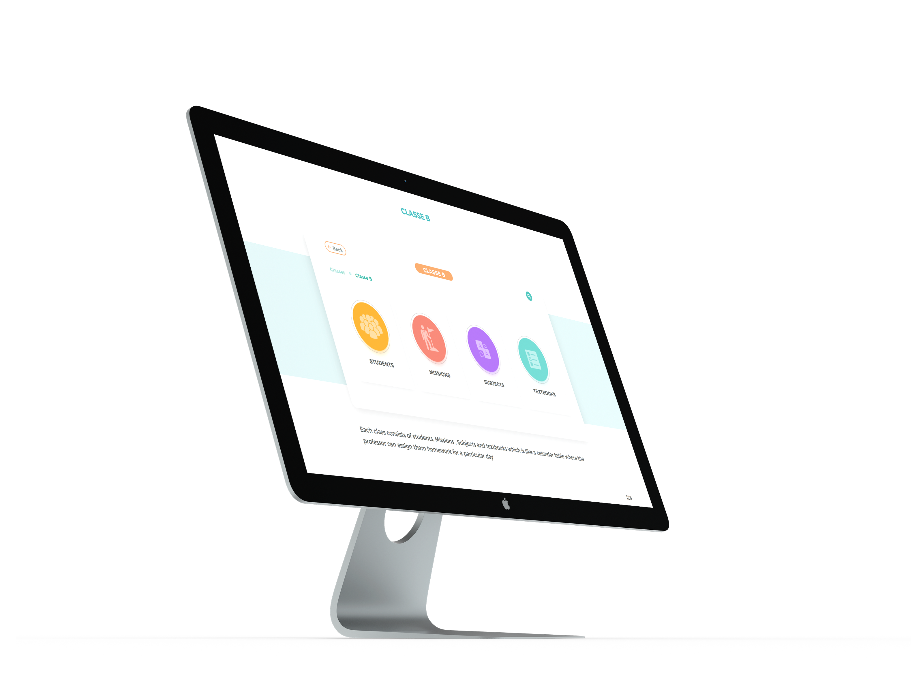
Floating action buttons for intuitive approach and provide easy access to features on every screen

Swot Analysis
Strength | Weakness | Opportunities | Threats


Teacher portal
Sneak peek


I got a chance to brainstorm and execute user research for our secondary audience for the last one month of my work at 3 Minds digital. This helped me perform my first hand user research with a specific set of audience based in Morocco.
DEMO-GRAPHICS - Age- 6 - 13 years old - Primary education
LOCATION : Service is available in Morocco
PSYCHO-GRAPHICS
NATURE OF USERS: Enthusiastic learners
PRIMARY LANGUAGE OF INSTRUCTION FRENCH


KOOLSKOOLS
E-Learning portal for kids that provide imprinted experiences and enhance study
ROLE
Research
Branding
Visual Design
TOOLS
Sketch
Illustrator
Photoshop
TEAM
Client :
Nourendine
Amrani
DURATION
6 months
Development in progress

Content and Features
Too much text, right? That's how much information we had to work and segregate on this student dashboard.
A lengthy list of features, which were a combination of clients needs and some that were brainstormed post our research.


Closed Card Sorting
Card sorting with kids is hard, especially when its remote.So, we resorted to asking simple questions like " When you open your application, what would you like to do first?" or "How many times would you study a single subject?" and simultaneously arranged our post its to get a fair idea

Information Architecture

KOOLSKOOLS
Encouraging online learning through intuitive features and peer collaboration
3 Minds Digital
Branding | Web Design | UI/UX
TEAM
ROLE
TOOLS
DURATION
Kriti Gohil
Naman Shukla
Tribhuvan Suthar
User Research
Client communication
Wire framing
Visual Design
Sketch
Illustrator
Photoshop
6 Months


!Launching in 2023
And, of course we needed some adult audience validation on our Information Architecture
"Wow, it looks intense, So i'm sure it's correct"
- A non-designer
But on a serious note, we got good feedback on the higher level navigational preferences and validated them during our wire framing phase

Wireframe
We performed a wireframe prototype test on web as well as different mobile devices to understand ease of navigation as well as content hierarchy in a mobile approach

What's your visual preference?
As we reached our final stage of setting the visual language, we definitely had a good amount of research as to how the look and feel should be, but we also wanted to know what the clients preferences were.


Mood board and Visual language


How might we generate online learning content that creates the same impact as physical learning?
How might we build trust through a digital medium that can assure parents the growth of their children?
How might we create a brand and a cohesive visual language that can cater to all 4 target audiences?
TIMELINE
Key Projects
Over the span of 3 years, I worked on multi scale projects ranging from device to needs.


Analysis Insights
By conducting the competitive analysis, we understood the current market trends, user behavior towards similar application, success scores, time on task, users’ subjective ratings, or a scorecard developed to analyze finding and also leading us to mindful questions for our product
What are the biggest strengths of competing designs?
What trends arise across sites – and are they good or bad?
Is there any opportunity to stand out from the competition?
Research Insights
As an International client, our biggest challenge that prepared us for the post pandemic working is that we had to remote research most of it. Especially when researching for a younger audience, we had to resort most on the observational methods such as using Hotjar tools, shadowing them etc. We observed 9+ students from a different age range and came up with important insights
Spent more time on visual heavy pages and didn't like too much text
Enjoyed navigating to activities and games from the home page
Did not spend too much time on homework and classroom data because the text made it boring

STUDENTS
Primary TG

Explorations


FINAL SCREENS
TAKEAWAYS
As much as you want to explore and dig deeper into concepts, mainstream learning for e-learning products always workout well if not more. But they definitely might not be able to compete with the new products in the industry with all the technological inclusions in learning.
Mainstream always works
This project was solely based for an audience and our client based in Morocco. As we discussed a year long project with multiple audiences involved, our discussions were initially led with a bump due to a lack of common language but the power of creative communication made the process smooth
